A Really Simple Intro to Changing Styling Using React State

I'm a Frontend Developer from the UK working mainly with JS and React
When using React, one of the easiest ways to make style changes to an element on an event is by using state.
In this example, we'll be looking at how we can change the corners of a button from pointed to rounded on click. I know this isn't something you're likely to be doing on a regular basis but it's a nice easy task, just to get to know the concepts.
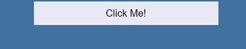
From this -
To this -

To use this method, you'll need to be using a Class Component rather than a Functional Component.
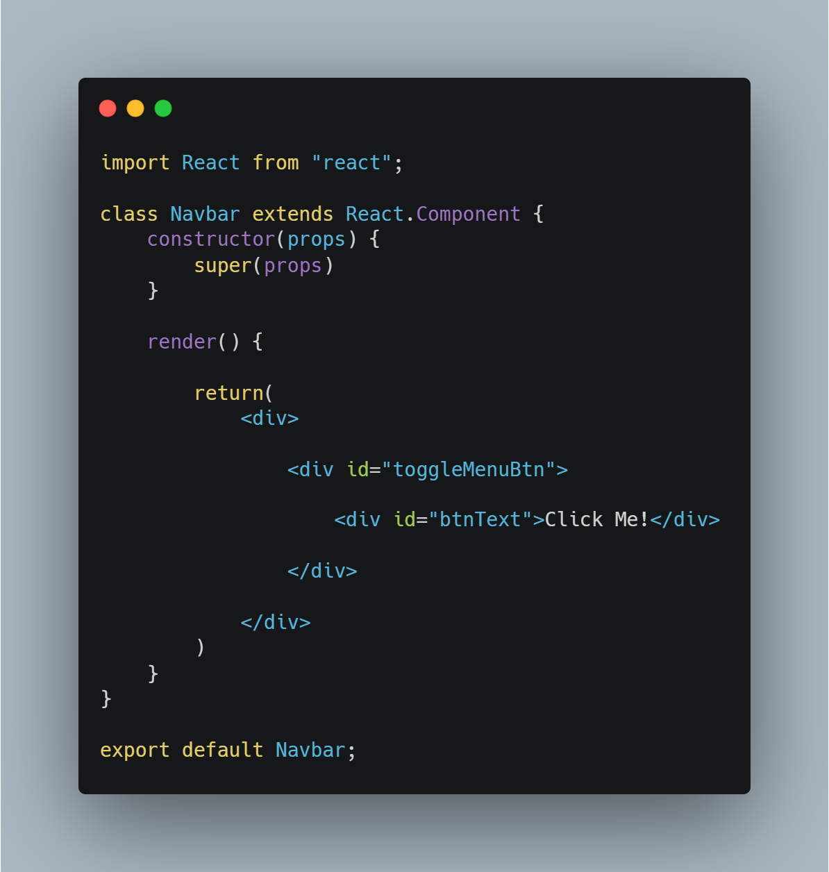
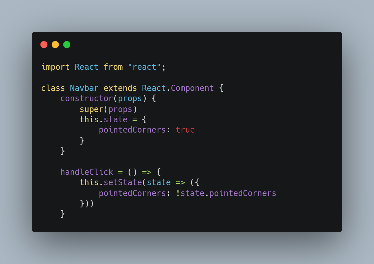
Here's our starting .js file, with a simple button and some text.
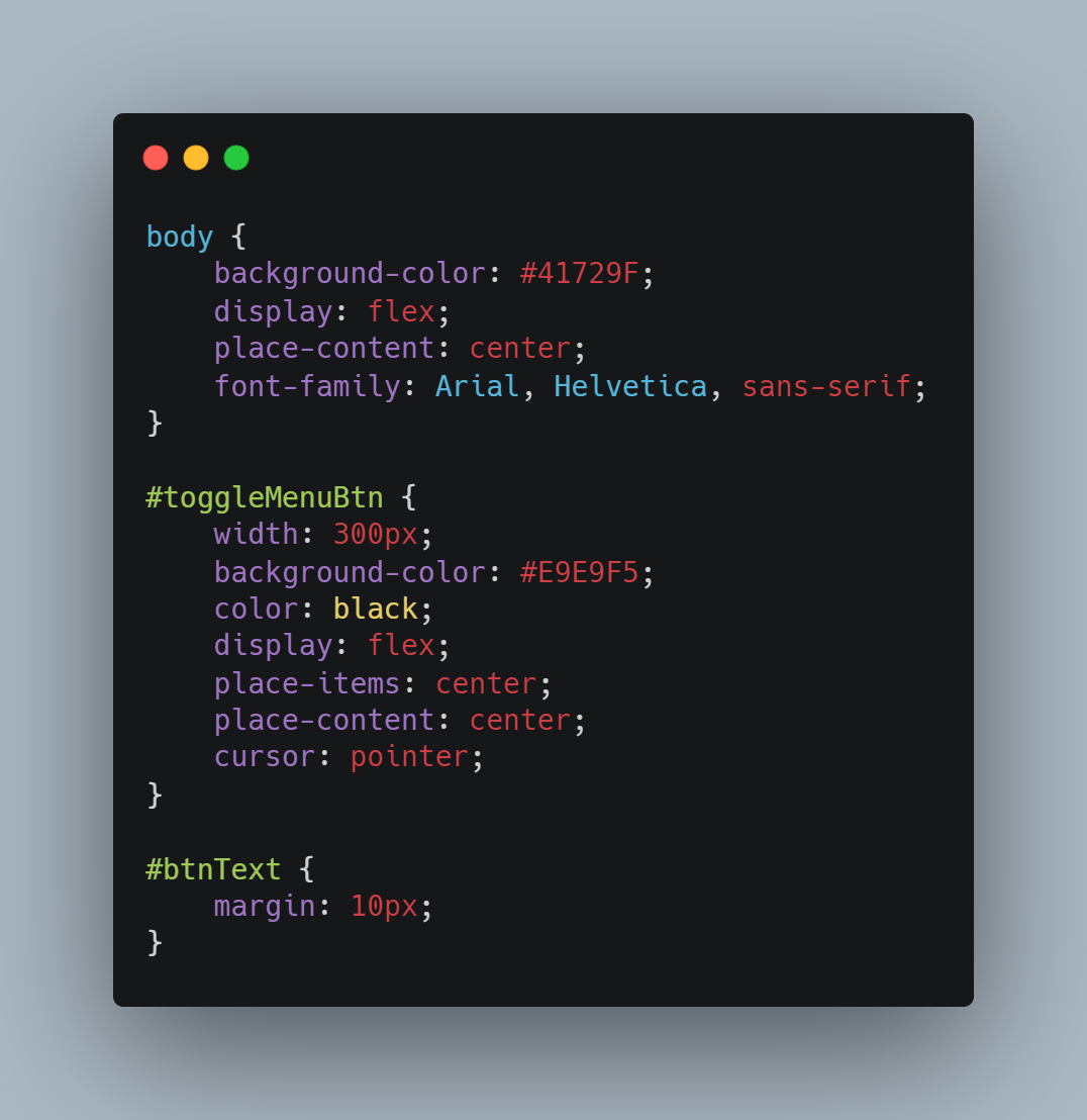
And our starting CSS with some simple styling.
 So how do we get it working so that the corners will be rounded when you click the button?
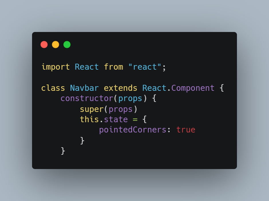
First, in our .js file, we'll need to add a new state. You can call this whatever you like but I've called it 'pointedCorners' in this example. Currently, the corners of the button are pointed so we can set the state of 'pointedCorners' to true.
Next, below the constructor, we need to add a new method which will handle the click and toggle the state of 'pointedCorners' between true and false depending on what the current state is.
We'll call our method 'handleClick' for obvious reasons. This checks for the current state of 'pointedCorners' and changes the state to be the opposite.
Be sure to bind your method in the constructor like so -
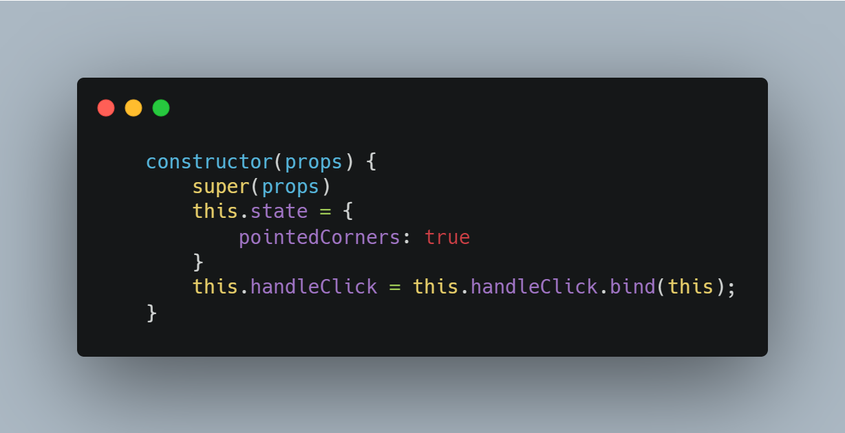
Binding ensures that 'this' is defined when you call the function.
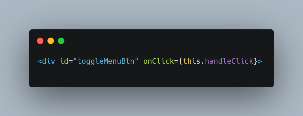
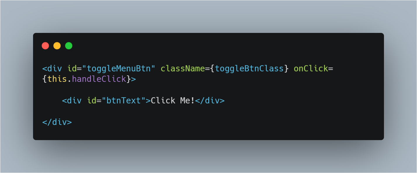
We now need to link our method to the button so that the method runs when the button is clicked. Do this by adding {this.handleClick} to the onClick value in your button.
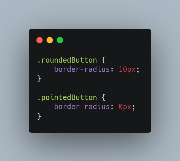
Next, we'll jump over to our CSS file. We need to add two classes which can be applied to the button depending on whether the 'pointedCorners' state is true or false. In this case, we'll add one which sets the corners to be rounded and one that sets the corners to be pointed.
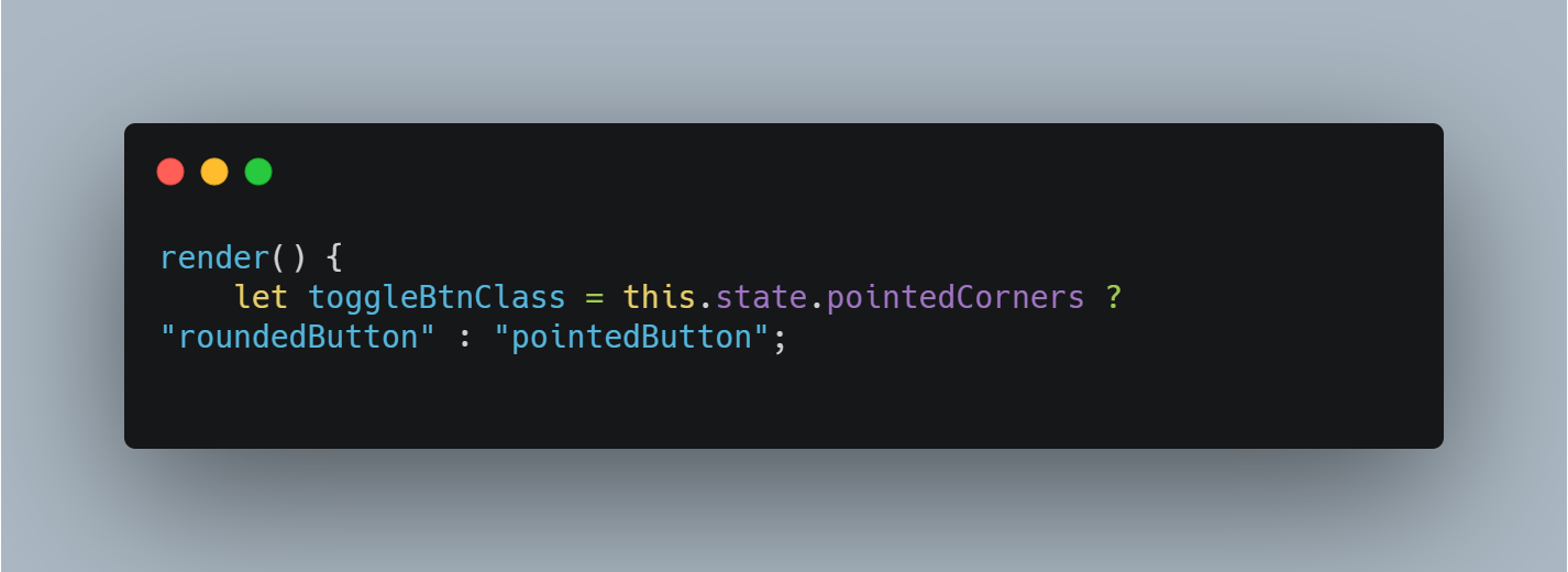
Then we'll jump back over to the .js file. Within the render method, we need to add a new variable. We'll call ours 'toggleBtnClass'. The variable uses a ternary operator to check the current state of 'pointedCorners' and if it's true, the class is set to 'roundedButton', if it's false, the class is set to 'pointedButton'.
Finally, we need to set the className of the button to the 'toggleBtnClass' variable.
You should then have a button that changes when clicked.
You can find the GitHub repo for this exercise here .


